
by Dilip D’Souza
Nearly six years ago, I lost a good friend to cancer. It was tragedy compounded, because he had lost his wife to cancer a few years earlier. That left their two daughters, orphaned in their 20s. More recently, another good friend has been struck with the disease. I know others too, as I’m sure you do as well.
What’s clear to me by now is that this is a relentless disease, not often defeated. With my friend and his wife, both were first diagnosed all the way back in 2004, within months of each other, when their girls were under ten years old. Both went through treatment and lived several happy, fulfilling lives, raising their daughters. But then the disease struck back with menace and intensity, showing up unpredictably in different parts of their bodies. They fought hard, but the cancer finally won.
Wrenching times for them, the daughters and for all of us who knew them, yes. Through it all, and in the years since, I often found myself musing about what it all meant, or came down to. Every time my friend went through a particular procedure, he’d tell me something about what the chances were of its success. Though he knew, and I knew, that “success” was really a euphemism for his survival. It’s 75 percent if nothing else comes up, he’d say, or some other such number. Presumably he had been told so by his doctors. Whatever the number, it was invariably hard to hear. Because each time, it hammered home the full import of that word “survival”. Because each time, it made me conscious of how these odds are calculated at all: by accounting for the people the disease takes from us. One of every four gone? There’s your 75 percent figure.
And if that’s just obvious stuff, consider the same numbers this way. Suppose you suffer from a rare and dangerous disease. A doctor examines you and spells out two possible treatment routines. You do your homework and find that treatment A gives you a 75 percent chance of recovery. With treatment B, one of every four patients dies. “Choose”, says your doctor. I suspect your choice would be A, and the same for most of us. That’s the power of merely mentioning death. Yet both statements say exactly the same thing. So if you had to decide between A and B without knowing anything more about the treatments, might as well toss a coin.
For some time after the reality of my friend’s death sank in, and given his mentions of his chances, I was mildly obsessed with figures like these. No surprise, it turns out that they have a grounding and a definite meaning in statistics. That they are a little more intricate in their implications than I might have guessed. The survival rate my friend would quote typically refers to the fraction, of people known to have that cancer and that treatment, who have survived five years after being diagnosed. But look a little beyond and things are a little more complex.
Now the numbers I heard from my friend came from graphs that years of cancer-driven epidemiology have produced – and well, we are of course looking at cancer here. But graphs like those are also useful in analyzing unemployment, or estimating how long mechanical parts will last before they fail (four years, in the case of a certain switch in my kitchen), or more. In 1958, Edward Kaplan and Paul Meier submitted similar papers on drawing and analysing such graphs to the Journal of the American Statistical Association. Noticing the parallels, JASA’s editor persuaded Kaplan and Meier to join forces. Their resultant paper – their combined effort – is a well-known and widely cited primer on how to handle observations that are essentially incomplete. What statisticians now know as Kaplan-Meier curves help us estimate the probability of something – like a patient surviving, but also like a switch failing – happening in a given interval of time. Such “times-to-events” may differ from subject to subject, and these curves offer us a way to make reasonable predictions.
Not that I want to beat this into the ground, but the issue of switches is a minor head-scratcher for me. For on a wall not far from the switch that failed within four years is another that has lasted … 45 years and counting. With daily use. Is this an outlier? Do Kaplan-Meier curves account for it as well? As long as it works like a charm, does it even matter?
Be that as it may, you can imagine a study in which several cancer patients are given a particular treatment. The patients take the treatment knowing that a cure, or survival, is not guaranteed, especially if the treatment is experimental. But they want to know, as anyone would, the chances that they will survive. Kaplan-Meier curves offer clues.
For a random example, six Japanese scientists published a paper a few years ago, presenting the results of studying 178 patients with “large brain metastases” – that is, tumors larger than 10cc in volume. Specifically, they were interested in the effect of a particular treatment – “Gamma Knife Radiosurgery (GKS)” – on these patients. (Comparison of two-stage Gamma Knife radiosurgery outcomes for large brain metastases among primary cancers, Daisuke Ito et al, Journal of Neuro-Oncology, March 2020).
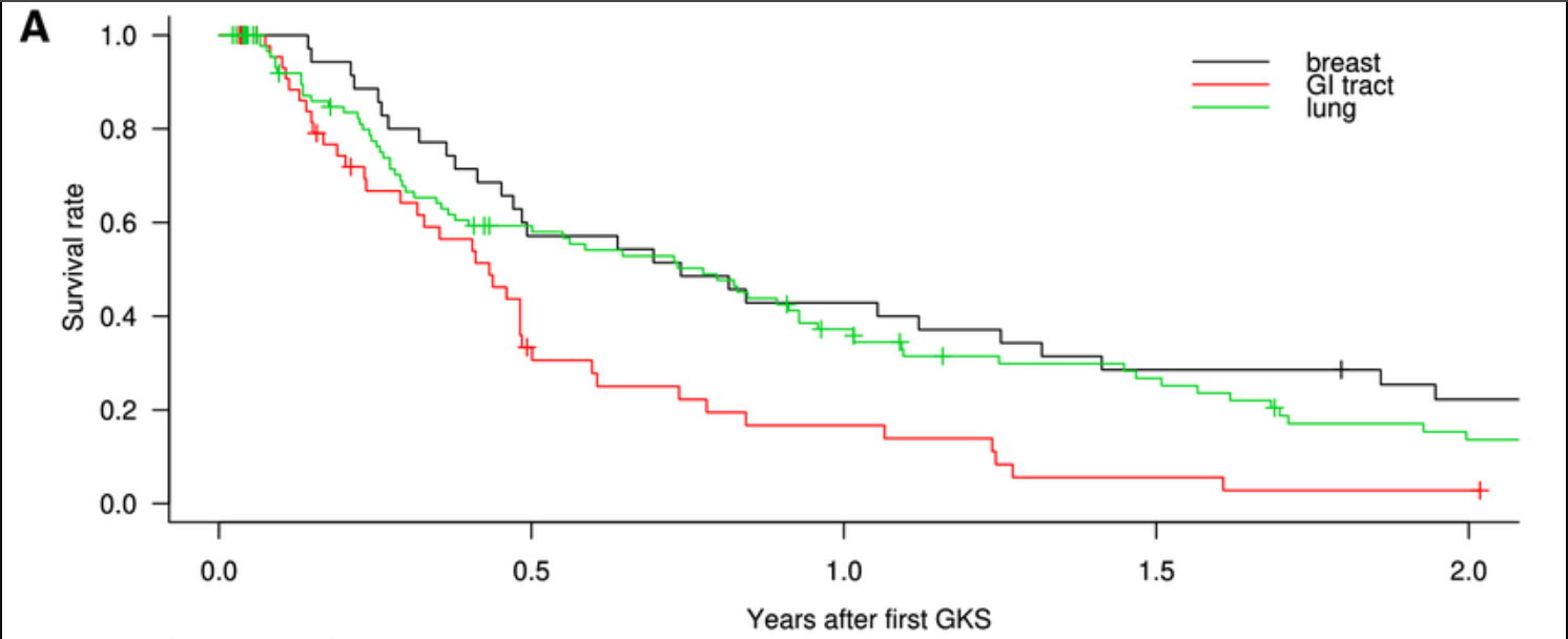
Note that data from 178 patients is, by necessity, a set of incomplete observations – obviously, the scientists did not have data on everyone who has these tumors. But the 178 make up a sample. The statistical assumption is that when you have a sample that’s large enough, you get a close enough approximation to the survival rate for everyone suffering from such tumors. The tumours had been caused by three types of cancers – breast, lung and gastro-intestinal. Thus there are three Kaplan-Meier curves in the paper. Each plots survival rate among the patients against time, measured by years after the first GKS. Wny, you might wonder, are these not smooth curves, but instead descend step-wise? That’s because this is a sample. Every vertical segment represents the death of another patient. The greater the sample size, the smoother the curve.
Note a few things immediately. First, the median time of survival – the time until exactly half the patients have died – is 6.6 months.
Second, breast cancer is noticeably less lethal than the other two, and gastro-intestinal cancer is clearly the most threatening. The gap between GI and the others widens dramatically after that median point. The scientists acknowledge these findings: “Compared with patients with [breast] and [lung cancers], patients with [gastro-intestinal cancers] had shorter [survival rates] and a higher incidence of [death]. Compared with patients with [lung] and [gastro-intestinal cancers], patients with [breast cancer] had significantly higher tumor reduction rates.”
So what does this paper offer to people who have brain tumours? If their tumours have metastasized from breast or lung cancers, they should consider GKS. If from their gastro-intestinal system, GKS “should be carefully considered and adapted to each unique case”.
Maybe that’s not saying very much. But I know, from following what happened to my friend, how eager he was for any information – anything that could give him and all of us some hope. I know he would have devoured findings like these.
Then again, he lived 16 years after he was first diagnosed with cancer, 18 months after the disease returned, metastasized, to ravage him. Does that make him an outlier?
The thing is, over the years these curves develop ever-longer tails, obvious even in the image above. This is because some patients live with their cancers for years. Each one who does adds something to the tail of the relevant Kaplan-Meier curve. Only, it is never possible to decide where exactly on the curve your patient is. (With a switch, it probably doesn’t matter.) As the late Paul Kalanithi – neurosurgeon and author, taken by cancer in 2015 – once wrote in the New York Times: “It’s impossible, irresponsible even, to be more precise than you can be accurate.”
So I don’t know if my friend was an outlier. I’m just grateful for those 18 months, those 16 years, and really, all his 60 years.