Matthew Klein and Cardiff Garcia over at Klein’s Substack:
Last week I had the chance to collaborate with longtime friend and former colleague Cardiff Garcia by appearing as the guest on The New Bazaar podcast. I encourage you to listen to the whole thing using your preferred platform.
We had a lot of fun and we covered a ton of ground. (We also recorded the podcast on November 4, which means that we didn’t have the October jobs or inflation data yet.) But while we kept our conversation as grounded as possible, there were a lot of numbers getting thrown around. So we both thought that it would be helpful to provide a set of charts to help listeners follow along with our conversation.
There won’t be much text in this piece, but there will be lots of useful visualizations for anyone trying to understand what’s happening right now in the U.S. economy. The charts are presented in the order in which we covered each subject.
Are We Producing More than Before the Pandemic?
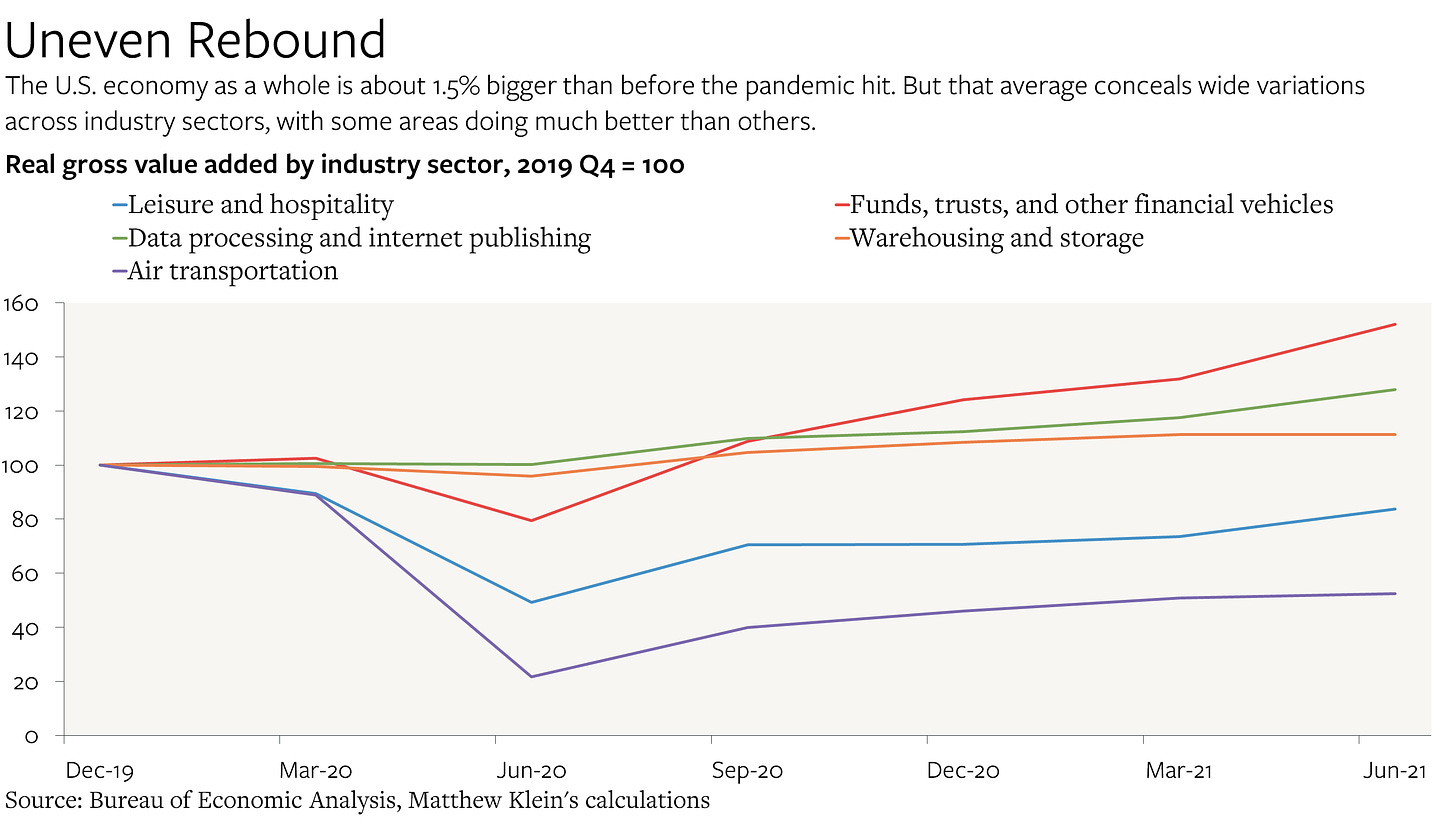
Yes! About 1.5% more in July-September 2021 than in October-December 2019, on a seasonally-adjusted basis. That’s pretty remarkable considering the death, devastation, and disruption that’s occurred since the end of 2019.
But these aggregate measures of production mask big differences across sectors. Businesses involved in cloud storage, asset management, retail brokerage, and warehousing have done phenomenally well, offsetting the continued depression in sectors such as leisure, hospitality, and passenger transportation.
More here.

