
by Thomas O’Dwyer
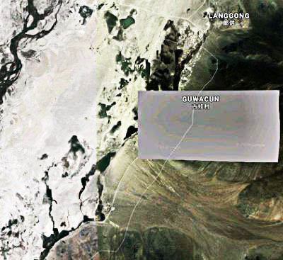
Truth may be the first casualty of war or, nowadays, of politics, but few of us would have thought of using a map to look for lies. But thanks to Google Maps and other geographic meddlers, there may now be fewer lies in a Donald Trump speech than on the face of the good Earth. It’s not hard to find places Google doesn’t want you to see, but not all are as obvious as its satellite image of a part of southern Tibet. There, the entire village of Guwacun lies under an unsubtle grey rectangle. Such geographical censorship goes far beyond pandering to mandarins in some Chinese ministry of paranoia. Take democratic, advanced, high-tech Israel, for example. Only low-resolution images of the entire country and the surrounding Palestinian territories are available online. Google alone is not to blame for this — America is. In 1997, the US government passed a law called the Kyl–Bingaman Amendment. This law prohibited American authorities from granting a license for collecting or disseminating high-resolution satellite images of Israel. The US mandated censorship of commercial satellite images for no other country in the world except Israel.
The largest global sources of commercial satellite imagery include online resources, such as Google and Microsoft’s Bing. Since they are American, the US has used the “Israel images amendment” as a powerful tool for suppressing information. Hence, images of Israel on Google Earth are deliberately blurred. Strangely, anyone in the world can zoom in on crisp and detailed pictures of the Pentagon or GRU headquarters in Moscow, but all one can see of Tel Aviv’s public central square and gardens is a fuzzy grey blur. This odd restriction has frustrated archaeologists and other scientists who depend on satellite imagery to survey areas of interest to their disciplines. It does, however, enable Israel to conceal practices in the occupied Palestinian territories that attract international censure. These include expanding Israeli settlements in the West Bank and Golan Heights, demolitions of Palestinian homes, and abuses of power by the military in clashes with Gaza.
The Kyl–Bingaman Amendment was a shameless act of censorship enacted under pressure from Israel using the ever-convenient blanket of “threats to national security” as leverage. Restricting images delivered by a service like Google Earth violates the mantra of “openness and freedom” mouthed meaninglessly by Google executives. Enacting censorship on behalf of powerful governments in Washington and Beijing who threaten its commercial interests is increasingly Google’s default spineless policy. The company’s splendid founding motto, “Don’t be evil,” has long since left the building.
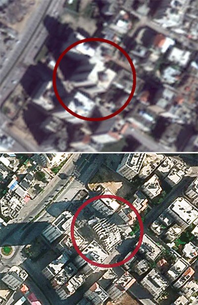
There are now cracks in the Israel images saga. Last year US regulators said they would allow the sale of resolutions down to 0.4 metres. Under the existing amendment, companies could not sell images that showed items smaller than two metres across, which explains the foggy Israel of Google Earth. Though the amendment is crumbling, Google has not yet updated its maps to show sharper resolutions. The US announcement surprised Israel’s Defence Ministry, which said that annulling the image law exposed the country to potential security issues. “I don’t think they asked us,” a peeved ministry spokesman told a radio reporter. “We would always prefer to be photographed at the lowest resolution possible… to be seen blurred rather than precisely.” On February 25 this year, the Associated Press reported new and extensive construction taking place at Israel’s nuclear centre in Dimona. The AP based its reporting on sharp new images it had obtained from Planet Labs, a private satellite imaging company in San Francisco, and published with the story. The difference between the tired-looking fuzz around Dimona on Google Earth and the crisp Planet Labs pictures, taken by its fleet of 200 miniature Dove satellites, is startling.
An exhibition titled “Anti-Mapping” is currently running at the Tel Aviv Museum of Art to illustrate the impact of limited access to high-quality photography. It features spectacular images that present an alternative to the official mapping that the state controls. Over several years, the two photographers who assembled the exhibition had travelled the country documenting contested or controversial sites from the national narrative. They photographed Arab towns destroyed when Israel was founded in 1948, plus officially unrecognized Bedouin Arab villages and areas along the Green Line that separates Israelis and Palestinians. The photographers used drones to take thousands of pictures and used them to assemble a 3-dimensional model. From 2,500 drone images, they created one multi-layered photograph for the museum exhibition at a resolution of 1.5 centimetres per pixel. That is 100 times greater than most of what is currently available online, and the images stretch across huge displays attached to the walls of the museum’s photo gallery. The photographers reconstructed detailed maps specifically of places where the state strives to erase, obstruct or hide.
Mapping has been increasing exponentially in importance, in lock-step with developing location applications on our smart devices. In their book Age of Context, Robert Scoble and Shel Israel wrote that maps are one of the five forces driving the world towards the next era of technology. (The others are mobile devices, social media, big data, and sensors). Most mobile apps can now know where you are, what you want to do or where you are going. The authors say location is an essential part of most new social networks, and, almost by definition, mobile wouldn’t matter if it didn’t involve location. “Without location, mobile apps have no ground. They lose their context,” they wrote. It follows that the accuracy and definition of mapping will be of enormous importance.
In September 2012, Apple attempted to cut into Google’s earth imaging monopoly when it added a new mapping app to a release of its operating system. It quickly turned into a disaster, seriously denting Apple’s hard-won reputation for the elegance and excellence of its products. Scornful social media posts declared that there were now lies, damn lies and Apple Maps. One Twitter comment said, “Not all those who wander are lost. They’re just using Apple Maps.” The Guardian wrote:
“Within minutes of the launch of Apple Maps, users were reporting that Paddington railway station had vanished, the maps relocated London itself to Ontario, the Sears Tower in Chicago had shrunk, and Helsinki railway station had turned into a park. Dublin, meanwhile, has been gifted with a previously undiscovered airport.”
Apple’s blunder was a reminder to all who take maps for granted that mistakes or lies are no laughing matter in the real world. The online humour quickly turned sour if you were using them to find your way along a dark and wet road late at night where a missing bridge could be a matter of life or death. Apple erased famous landmarks from their sites in cities around the world; others disappeared underwater. Drivers reported that voice directions were misguiding them; one man was urged to take an abrupt turn while driving on the mid-span of a suspension bridge. The maps were so dangerously flawed that Apple’s CEO Tim Cook publicly apologized and urged his customers to use arch-rival Google Maps.
Apple had miscalculated the enormous challenge of building a mapping device in a hurry. When Apple Maps launched, Google already had some 7,000 employees working on its mobile maps. Google had a seven-year lead in every aspect of developing global mapping. Apple’s stumble has left it lagging even nine years later, and while the accuracy of its maps has improved substantially, many of its customers are still wary of trusting them. In their Age of Context, the authors consulted Daniel Graf, the director of Google Mobile Maps, and asked him what it takes to build a map platform. Graf said that to do maps right, there are three essential components — first, build a foundation, and the foundation of all maps is a massive amount of data. The second task is the most daunting, keeping track of changes because local data is in a state of constant flux. Street names, addresses, directions and businesses change all the time. The third essential Graf said is personalization. “Maps become more valuable when they have a sense of where people are, what they are doing and what they want to do next.” He noted that the first two components of success in mapping need data, while the third involves context.
Graf implied that Apple had grossly underestimated the scale of these tasks when it tried to rush out its application.
Google may have been laughing as its maps accurately guided it all the way to the bank. Still, Apple’s embarrassment didn’t shield it from storms of criticism about its own mapping policies, among its many other too-big-to-be-trusted issues. Google may get a pass on the accuracy of its maps for general daily use, but while blacked-out sites are one side of the critical coin, privacy is the other. The cameras of Google Earth and Google Maps have poked their intrusive noses everywhere, scooping up not just street pictures but wifi transmissions from the buildings they drive past. There has also been the general air of arrogance and “couldn’t care less” in many of Google’s responses to valid criticism. Its former CEO Eric Schmidt once said, “if you don’t like it, just move,” when asked about people being upset that their homes were exposed online. Google also maintains a list of properties and sites it either blacks out or blurs in its images. Some are probably valid military or strategic installations or the residences of prominent people, but Google generally refuses to offer any explanations for such decisions. It turns defensive when accused of bowing the knee to dictatorships and information controllers like China.
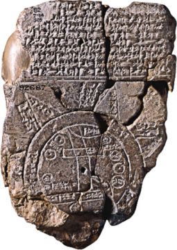
The sporadic eruptions that occur over the perceived sins of Google or Apple mapmakers may seem like a phenomenon of the age. Still, it is surprising how often maps have been used or misused for propaganda or nationalist point-scoring almost since they first appeared. The Babylonian Imago Mundi is the oldest known map ever found, dating to the middle of the 6th century BCE. Already it has a point of view rather than dispassionate objectivity. The unknown Babylonian who created it placed the Kingdom of Babylon at the centre of the map with nearby Assyria and Elam on the rim of the tablet. The map mainly shows the areas depicted in their correct place. Still, it also indicates the Babylonian view of the mythological world — the Imago Mundi mentions 18 mythical beasts native to Babylonian culture.
Despite the occasional manipulators, maps have remained one of the most trusted forms of communication and seem to have inherent credibility. That, of course, makes them great for getting your message across with a bit of creative cartography. In more recent times there has been some blatant skewing of maps to purposes other than finding one’s way or informing about world geography. In the heyday of the British Empire, London cartographers became masters of drawing persuasive maps that promoted the size and power of a global empire run from a small island nation, using visual and geographical tricks to shape the viewer’s perception. An extra-wide 1890 map of the British Empire extended 490 degrees of longitude across a globe with only 360 degrees, allowing red-coloured India, Australia, and New Zealand to appear not once but twice.
In his classic bestseller How to Lie with Maps, Mark Monmonier explained how cartographic projection could be a tool of deception. Several Cold War period American maps of the Soviet Union often portrayed an unusual polar viewpoint to exaggerate the reach of communism. A 1958 map created for Time magazine put a robust visual emphasis on Alaska’s strategic location relative to the Soviet Union. In the map’s distorted birds-eye perspective, you really could see Russia from Sarah Palin’s front door.
Along with its benefits, advancing technology brings new headaches. The latest tool becoming available to map manipulators is deepfake imaging. Deepfake photographs and videos have appeared online for a few years, primarily as fabricated celebrities, a fake Tom Cruise or Barack Obama. The technology used for harmless fun can quickly become unfunny. Deepfake geography, like faked celebrities, can have uncanny realism, and therein lies huge potential problems. It can be almost impossible to detect digital imposters in doctored images of the Earth itself. Intelligence agencies believe China is already a leading expert in using deepfake technology to trick computers into seeing objects in satellite images that aren’t there. This has dangerous implications for military planners in particular. An enemy might fool your imagery analysts into reporting that a bridge crosses an important river at a given point. If a commander then plans a mission that depends on his troops crossing a bridge that doesn’t exist, it’s a mission that can end with a nasty surprise.
An even more surprising encroachment of technology on cartography emerged four years ago. Strava is an American internet service for tracking exercise with social network features and is mainly used for logging cycling or running, getting its data from GPS monitoring. In November 2017, Strava published a “global heatmap”, a visualization of two years of data from its international network of athletes. Two months later, an Australian university student noticed that this had revealed military bases, including American bases in Syria and Afghanistan and a British naval base that is home to the UK’s nuclear weapons. It became apparent that this harmless fitness tracking app revealed the location of secret facilities. Data about exercise routes used by soldiers could pinpoint and even outline secret overseas bases. Even on blurred satellite imagery, when Strava data was overlaid on an area, the heat maps of military exercise and fitness training routes stood out like brightly lit streets. Using more than three trillion data points uploaded over time to Strava, the app could even spot the track of a solitary individual exercising in a remote area. Strava has since introduced modifications and op-out features to strengthen privacy and prevent users from seeing other users’ routes.
In an interview with Australia’s ABC News, Dr. Amy Griffin, a senior lecturer in geospatial science, cautioned against putting all the blame on Google for manipulating or hiding information on maps, be it in error or with serious intent. “Google itself probably doesn’t care about what sites you can see,” she said. “It is relationships with other entities that drives what’s taken down. These requests are made usually by governments of various sorts because it has some kind of facility that they don’t want publicly known — and they haven’t made steps to disguise it in the landscape. With the number of satellites around, it’s reasonably hard to hide things compared to how things used to be.”