
Morgan Meis in The Easel:
 Betroffenheitskitsch. It is not an easy word to say. That’s because it is German and Germans love to make compound words. The core of the word is the adjective betroffen, which means ‘affected’, but also ‘concerned’, and even ‘shocked’ or ‘stricken’. Betroffenheit is the noun and can be translated as ‘shock’, ‘consternation’, ‘concern’. Finally, we add the word kitsch, which makes the whole thing, well, kitschy. Betroffenheitskitsch is shock or deep concern that has been taken to the level of kitsch.
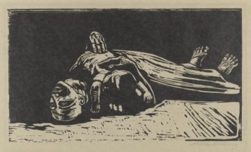
I bring this up in reference to the art of Käthe Kollwitz (1867 – 1945), the great German printmaker (she also painted and made sculptures) of the late 19th and early 20th centuries. There is, indeed, quite a lot of Betroffenheit in the work of Kollwitz. In fact, it is almost all Betroffenheit. Take, for instance, a work like The Widow II (1922). The image is woodcut on paper. It has all the strong lines and simple composition one expects from a woodcut. It is from the War series that Kollwitz produced several years after the end of WWI. Kollwitz’s own son, Peter, was killed in the war, and Kollwitz produced this series partly in response to her own grief.
More here.