
Hannah Ritchie at By the Numbers:
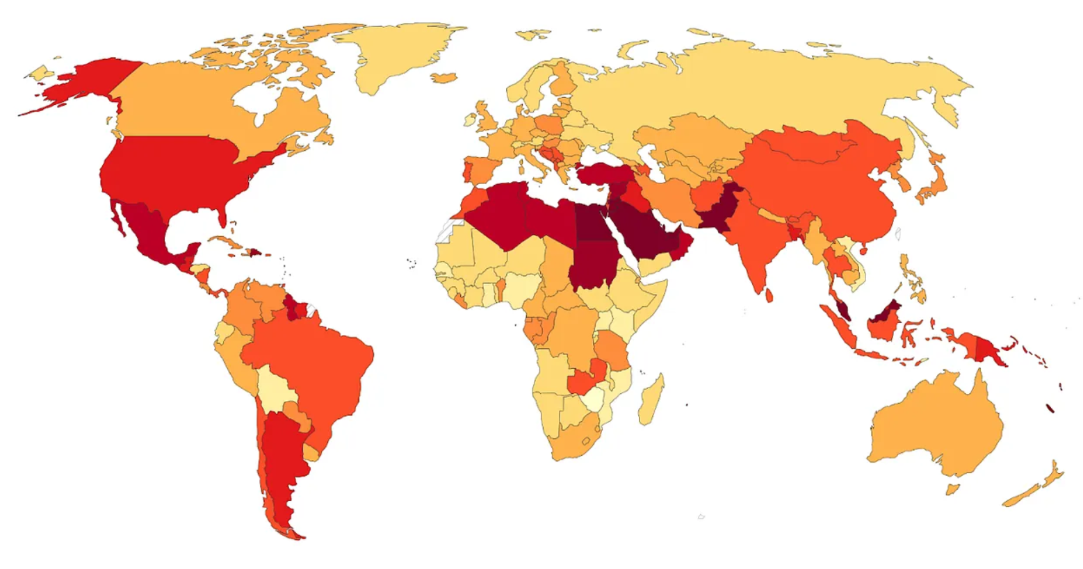 Which country has the highest rates of diabetes? Many people would guess the United States. Perhaps Canada or Australia? Mexico? The United Kingdom?
According to the International Diabetes Federation, it’s Pakistan.
Take a look at the map below, which plots the prevalence of diabetes among 20 to 79-year-olds.
Now, this data is what we call “age-standardised”. The risk of diabetes, like many diseases, increases with age. So if we were to map the raw (or crude) rates of diabetes, it would strongly reflect how old populations are.
To understand changes in prevalence and risk beyond aging, we use age-standardised metrics that hold the age structure of the population constant over time and across countries. It imagines that the age distribution of every country is the same.
More here.
Enjoying the content on 3QD? Help keep us going by donating now.