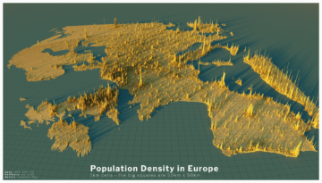
Alasdair Rae at Visual Capitalist:
 It can be difficult to comprehend the true sizes of megacities, or the global spread of 8 billion people, but this series of population density maps makes the picture abundantly clear. Created using the EU’s population density data and mapping tool Aerialod by Alasdair Rae, the 3D-rendered maps highlight demographic trends and geographic constraints.
Though they appear topographical and even resemble urban areas, the maps visualize population density in squares. The height of each bar represents the number of people living in that specific square, with the global map displaying 2km x 2km squares and subsequent maps displaying 1km x 1km squares. Each region and country tells its own demographic story, but the largest population clusters are especially illuminating.
more here.
