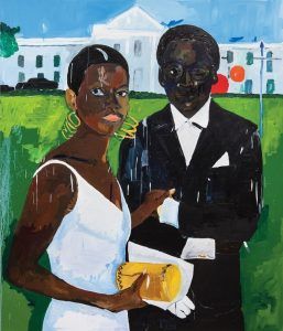
Zadie Smith at The New Yorker:
 Yet to speak of this painting as I have—conceptually—is to pass over the difference between thinking with language and thinking in images, and no narrative explanation of the relation between these two pictures is as compelling as the horizontal line that marks the credenza in the photograph and the edge of the White House gardens in the painting, or the verticality of the white man in the photo’s top-right corner—with his squared-off shoulders—and his painterly analogue: a blue flagpole, with its crossbar and absence of flag. Taylor thinks primarily in colors, shapes, and lines—he has a spatial, tonal genius. Form responds to form: the negative space around Cicely and Miles in the photograph suggests the exact proportions of the White House, yet in the transition the abstract sometimes becomes figured, and vice versa, as if the border between these things didn’t matter. A burst of reflected light in the photo decides the height and placement of the windows in the painting, while two round signs at the movie première—one for Coca-Cola, the other for “Orange”—which can have no figurative echo in the painting, turn up anyhow on the White House façade as abstraction: a red sphere and an orange sphere, tracking the walls of what, in reality, now belonged to Trump. Like two suns setting at the same time.
more here.
