
This text, which appears on 3QD as the second of a four-part post, was begun as a musing on the theme of series and repetitions in modern and contemporary art inspired by a challenge issued by an art historian colleague of mine. This post addresses the work of Frank Stella, one of many artists who’ve worked in this manner. For the previous post (intro and consideration of Wade Guyton’s work), click here.
Repetition and Remains: Three Centuries of Art’s Multiform and Manifold re-
Frank Stella (1936–)
Tracing Wade Guyton’s “ostensible monochromes” back to their perhaps obvious roots in Frank Stella’s earliest series calls for particular care. It’s a bit to easy to lump all-black or primarily black work together; consequentially, while that is the first of many connections—visual/ancestral lines, if you will—it’s also worth expanding upon that point and exploring the many facets that combine to form this lineage.
The relation to Albers’s Homage to the Square and Ad Reinhardt’s black paintings goes without saying. However, in addition to the early Black paintings (and prints), Stella also did a series of Aluminum paintings, Copper paintings, and several other series. Notably, the Black series originated in, and stemmed from, a couple of quite brightly colored paintings.
Typologically speaking, the Black paintings were Stella’s first real series. As the first, they differed from all his later series in many respects—not least in that a certain evolution was determinant from one painting to the next, such that they gradually became a series, after completion, rather than consciously starting out with the series in mind. As regards their sequence, even which of the series was truly the first Black painting came under dispute. According to curator Brenda Richardson [1], Stella identified the initial works of this series as follows: Delta, he claimed, was “the first black painting,” citing its previous landscape-derived abstract composition and development out of the underpainting [2]; Morro Castle was the first wherein he “consciously set out to make a black painting;” and Reichstag was the first all-black painting, devoid of all underpainting, all non-black spaces or lines, and empty of all other colors. These three are additionally linked as a group by the fact that they dealt directly with the marginal or “left-over” area—the corners and borders Stella saw as the regions where abstract expressionism faltered. As his attempt to justify (literally and typographically speaking) the pictorial plane’s relation to its edge grew more extreme, the small left-over areas of the Black paintings grew into the notches or “jigs” removed from the support itself to create the shaped canvases of the Aluminum series, ultimately evolving into the more fully shaped canvases of the Copper series and even later ones, such as the Protractor series.
I had the good fortune of viewing a few of the prints—all lithographs—from Stella’s Copper series at MoMA late last autumn: the curator pointed out what she termed the “modular” nature of the forms [3] (and what she viewed as their components); although it’s a creative idea and could potentially be seen as similar to Guyton’s use of pseudo-typographic modules in his printed compositions, one must remember that these are single-color plate lithographs printed in one pass, not woodblocks, and therefore each image was composed, as a unique whole, precisely as it appears on the page, rather than consisting of basic modules that were reconfigured to create each successive image.
As I hinted at earlier, the beginning of Stella’s Black series was painted over a previous abstract composition based on a landscape: Blue Horizon can ultimately be traced to Delta, an offshoot of sorts that he explored in the following Black paintings, Morro Castle, The Marriage of Squalor and Reason, Arbeit Macht Frei, and Arundel Castle. In Arundel Castle—unlike in The Marriage of Squalor and Reason, Arbeit Macht Frei, and other early compositions of the Black series—the proximity of the black stripes (and perhaps, to a slight degree, the paint’s bleed after application) is such that, from a distance or even in reproduction (the form in which far too many people are content to view visual art nowadays) the work initially appears to be a monochrome… until those interstices begin to surface in one’s eye.
Venturing back to these works’ colorful predecessors for a moment, art historian Megan Luke also identifies what she terms a “Coney Island group” of works as well, the immediate antecedents to the Black paintings. [4] In this she includes Blue Horizon—a prefect square with less-than-perfect horizontal blue stripes. While she doesn’t expressly define the distinction between “group” and “series,” observation of the paintings provides a clarification more concrete than any words can.
Speaking about Delta, Stella said “… when I superimposed a simple idea of banded organizational symmetry on top of landscape gestures, the resulting development changed everything. It completely changed the way I understood what I thought I knew about the painting of the past… [I]t gave me a very clear sense of how the making of painting was sucked into the continuum of painting….” [5]
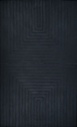
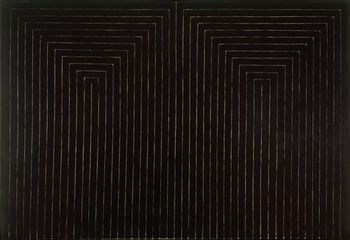
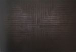
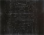
Fig. 4. Frank Stella, Arundel Castle, 1959 Fig. 5. Frank Stella, Arundel Castle from Black Series I, 1967
Enamel on canvas One from a portfolio of nine lithographs on paper
121 3/8 X 73 1/8 in. / 308.1 X 186.1 cm image: 13 5/16 x 7 15/16” (33.8 x 20.2 cm)
Gift of Joseph H. Hirshhorn, 72.276 sheet: 15 3/8 x 21 15/16” (39 x 55.7 cm)
Hirshhorn Museum, Washington, D.C. Museum of Modern Art: John B. Turner Fund
© 2008 Frank Stella / ARS, New York
Arundel Castle is unique in its vertical reflection, an extension of the form that appeared in Getty Tomb the same year. It echoes the composition of Morro Castle, but now the margins, those mirrored left-over areas—note, however, that the lines themselves aren’t mirrored, as the one running down from the upper left and continuing horizontally through the center doesn’t then turn back upward, but rather takes a downturn, ending in the lower right—have disappeared. And here we see a repeated U-shaped pattern that not only foreshadows (or, in this backwards reading, recalls) Guyton’s use of the same letter-like form, but also makes the most of that shape’s affinity to the rectangle of the canvas itself. The shape in the middle of his earlier stripe paintings (in works like Coney Island and Grape Island—those closest to revealing Stella’s observation of Jasper Johns’s Flag works) has also been removed, suggesting a merging of object (square) and pattern (lines) into one and the same canvas-consuming composition.
In researching this series, I came across an anecdote that exposed a beautiful contradiction: in Stella’s own words, “At the time when I was painting enamel stripes into cotton duck, I remember hearing a lot about Caravaggio … I thought to myself: ‘I hate Caravaggio; that’s representational painting. It’s ordinary. That’s what they love; that’s what they will never give up—its ordinariness. I want painting to be special, not ordinary. Abstraction is special …’ I was wrong on a lot of counts. Caravaggio was ordinary, but he invented an ordinariness that has carried painting farther than any such single efforts; and although abstraction is special, its specialness [sic] can be defined by its ordinariness.” [6]
But what of “ordinariness’s” other opposite? Rather than “specialness,” might it actually be closer to a disorder—dare I follow Stella in coining neologisms to say “disordinariness?” Aside from the visual solemnity uniting Stella’s Black paintings to Seurat’s drawings (as we'll see in the next and final part of this post), there is also a thematic parallel: despite its abstract composition, Stella’s Bethlehem’s Hospital, another lithograph from the 1967 Black series, calls the handicapped man in Seurat’s L’invalide to mind. An undercurrent of illness, disability, and even death could be read in both artists’ work. In the meantime, it’s worth repeating Birnbaum’s circuitous observations about Guyton’s work as well, to provide a (potentially postmodernist?) harmony of sorts to this thoroughly modernist melody.
Getting back to Stella, in each half of The Marriage of Reason and Squalor, II (1959, enamel on canvas, Museum of Modern Art), stripes outline stripes in an inverted U-shape, a regular, self-generating pattern. Filling the canvas according to a methodical program, Stella suggests an idea of the artist as laborer or worker. He also uses commercial paint—black enamel—and a house-painter’s brush. The systematic quality of Stella’s Black paintings decisively departed from the ideas of inspired action associated with abstract expressionism, the art of the preceding generation, and anticipated the machine-made minimal art of the sixties. But many of them, like this one, are subtly personal: Stella worked freehand, and irregularities in the lines of the stripes reveal the slight waverings of his brush. His enamel, too, suggests a bow to the abstract expressionist Jackson Pollock, who had also used that paint.
Stella’s use of stripes was motivated by the work of Jasper Johns, particularly Johns’s paintings of flags. “The thing that struck me most,” Stella has said, “was the way he stuck to the motif . . . the idea of stripes—rhythm and interval—the idea of repetition.” But Stella went farther than Johns in “sticking to the motif,” removing the flag and leaving only the stripes. “My painting,” he famously said, “is based on the fact that only what can be seen there is there. . . . What you see is what you see.” [7]
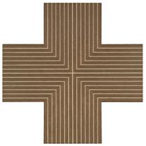
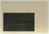
Fig. 6. Frank Stella, Ouray, 1962
copper oil paint on canvas mounted on masonite
25 1/2 x 25 1/2 in. 64.8 x 64.8 cm
signed, titled, and dated 1962 on the stretcher
Image courtesy of Phillips, de Pury & Company New York [8]
Stella completed a total of sixteen copper paintings; like most titles in the series, Ouray [9] (painted soon after Stella’s inclusion in the now legendary “Sixteen Americans” exhibition held at the Museum of Modern Art in 1959-1960) exists as two large versions and the present smaller version. This more intimate scale was executed at the suggestion of Castelli and Ivan Karp, who encouraged Stella to replicate the original copper paintings in a more ‘portable’ format. [10] “The copper pictures … represent the extreme—the limit—to which I could take the shaping. Even though so much is cut away—and in some cases so arbitrarily—what saves them, I think, is the fact that they keep echoing a kind of rectilinearity.” [11]
Ouray’s Greek cross, like the other works in the series, is an extraction from patterns in the Black paintings. Yet they operate as much more open pictures than the latter, and are defined less by their monumentality than by the thrust, even dynamism visible on the surface of their contoured canvases. It is composed on cardinal points, reinforcing the expansiveness of the picture field. Yet Stella’s rectilinear brushstrokes belie the sensibility of their irregularities. They’re impossible to reproduce. Separating the stripes are the pauses, the void-like spaces of painterly avoidance, wherein the supposedly flat picture plane is both challenged with hint of potential depth and exquisitely disintegrated into many separate picture planes (were one to read a stripe as its own entity, as Newman did in Oneness). Did it, as it would seem, have a systematic facture? Despite the work’s explicit regularity, the configuration of these paintings was rather more liberally conceived, through a process whereby the outermost border dictated the internal separation of the stripes. The working method on the copper series is supported by sketches. [12]
Tellingly, Stella readily speaks of the obsession so visible in these works: “For the following eighteen months [after moving to New York], I lived in a world dominated by painting. There was almost no distraction and no conflict.” [13] We’ll soon see how this relates to Seurat’s self-defined “confinement” in drawing. Could these lines be parallels of the paths each artist paced, up and down, back and forth, in his self-imposed mental cell? In Stella, the visible white lines are unprimed cotton duck canvas, whereas the black stripes are painted; the lightly penciled graphite lines occasionally visible in these interstices are in the negative space. They outline, but are not part of the stripes’ form. In Seurat, the lines do not outline, but rather build up the form. In both, there is a highly limiting, oddly self-negating (or is it self-positing?), exclusive use of line.
Before we move on to Seurat, I’d like to close this chapter with a phrase of William Rubin’s that helps clarify why this mode of working was so central to Stella’s innovative paintings in the fifties, and proliferated from the sixties (i.e. pop art) forward: “To some extent, the metamorphosis of a central idea in a single painting would be recaptured by its embodiment in a group of pictures constituting a series.” [14] How large or small, how limitless or reductive such groups can become remains to be seen….
Notes
1. Richardson, Brenda, Frank Stella: The Black Paintings (Baltimore: Baltimore Museum of Art, 1976), p. 12.
2. Stella, Frank, Working Space (Cambridge, MA: Harvard University Press, 1986), p. 155: “I took it for granted that the stripe paintings came from a fairly natural adaptation of overall post–World War II painting to a landscape instinct tempered down toward abstract rendering. In fact, that is the way the paintings actually developed—for example, from Coney Island to Astoria to Delta.”
3. Conversation with MoMA Prints and Illustrated Books Department Assistant Curator and her assistant, 16 December 2008.
4. Cooper, Harry and Megan R. Luke, Frank Stella: 1958 (New Haven and London: Yale University Press, 2006), pp. 1–65, esp. p. 38.
5. Ibid, 158.
6. Ibid, 162.
7. The Museum of Modern Art, MoMA Highlights (New York: The Museum of Modern Art, revised 2004, originally published 1999), p. 233.
8. Phillips, de Pury & Co., 14 November 2007, evening sale: Property from a Distinguished Private Collection.
9. Lawrence Rubin, Frank Stella Paintings 1968–1965, a Catalogue Raisonné, New York, 1986, cat. no. 92, illustrated.
10. Sidney Guberman, Frank Stella, an Illustrated Biography, New York, 1995, p. 72.
11. Frank Stella, as quoted in Exh. Cat., New York, Museum of Modern Art, Frank Stella, 1970, p. 68.
12. These sketches are reproduced in Christian Geelhaar, trans. Cirus Hamlin, Zeichnungen / Frank Stella’s Working Drawings 1956–1970 (Basel: Kunstmuseum Basel, 1980).
13. Stella, Frank, Working Space (Cambridge, MA: Harvard University Press, 1986), p. 153.
14. Rubin, William S. Frank Stella (New York: The Museum of Modern Art, 1970), p. 13.

Thanks for reading; previous Lunar Refractions can be found here, and you'll find for Part III on the main site on March 16….