Christian Rudder in the OKCupid blog:
All dating sites let users rate profiles, and OkCupid’s original system gave people two separate scales for judging each other, “personality” and “looks.”
I found this old screenshot. The “loading” icon over the picture pretty much sums up our first four years. Anyhow, here’s the vote system:

Our thinking was that a person might not be classically gorgeous or handsome but could still be cool, and we wanted to recognize that, which just goes to show that when OkCupid started out, the only thing with more bugs than our HTML was our understanding of human nature.
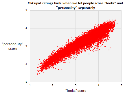
Here’s some data I dug up from the backup tapes. Each dot here is a person. The two scores are within a half point of each other for 92% of the sample after just 25 votes (and that percentage approaches 100% as vote totals get higher).

In short, according to our users, “looks” and “personality” were the same thing, which of course makes perfect sense because, you know, this young female account holder, with a 99th percentile personality:

…and whose profile, by the way, contained no text, is just so obviously a really cool person to hang out and talk to and clutch driftwood with.
After we got rid of the two scales, and replaced it with just one, we ran a direct experiment to confirm our hunch—that people just look at the picture. We took a small sample of users and half the time we showed them, we hid their profile text. That generated two independent sets of scores for each profile, one score for “the picture and the text together” and one for “the picture alone.” Here’s how they compare. Again, each dot is a user. Essentially, the text is less than 10% of what people think of you.
More here.
